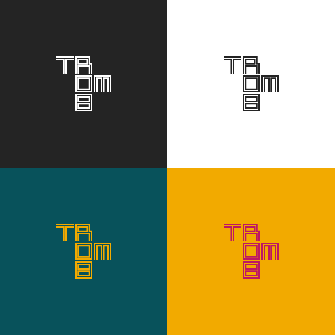
Logotype.
Our logotype consists of a stacked wordmark on top of a fully saturated color backplate as the primary representation of our brand. It is available in a number of predefined colors so as to be adaptable to different contexts.

How to use the logo
The primary logotype seen above is to be used whenever possible, with some breathable white space between the outer edge and the edge of your design or artwork. Try to use the above logos only.
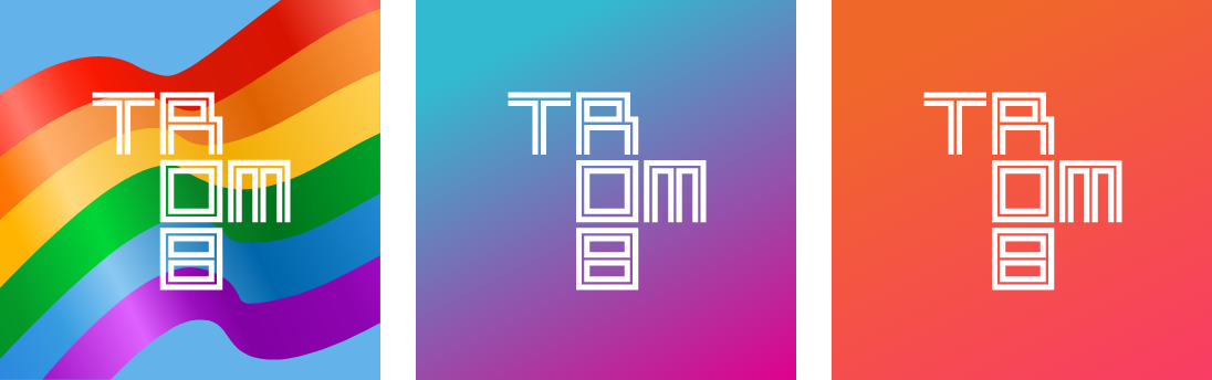
Legacy usage
Our previous ways of using the logo is discouraged, but not forbidden. In other words, only use this if you’re convinced that the primary logo will not work for your purpose.
Creative & limited time events
We are open to creative use of our brand for specific situations, but this should be cleared with the brand management team. Most importantly, if there is any possible controversy involved, we as a company must be able to stand behind it so as to not risk communicating virtues that would not hold up to scrutiny.
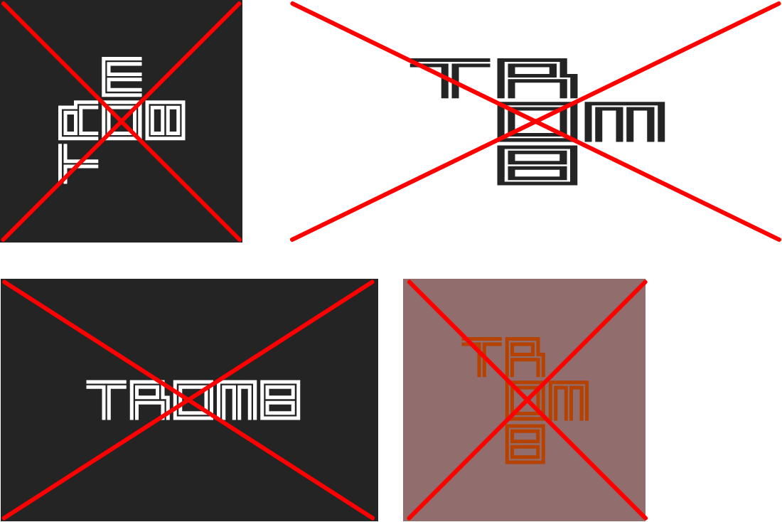
Don't do this
Creative use is one thing, but there are some things that are never allowed. Rotating, stretching, and rearranging the letters of the logo is always a no-no.
The same goes for using a low-contrast combination of colors, especially non-brand colors. Do not do this.
Download all logo files
The compressed archive linked below will provide you with both printable and digital version of our primary logo.